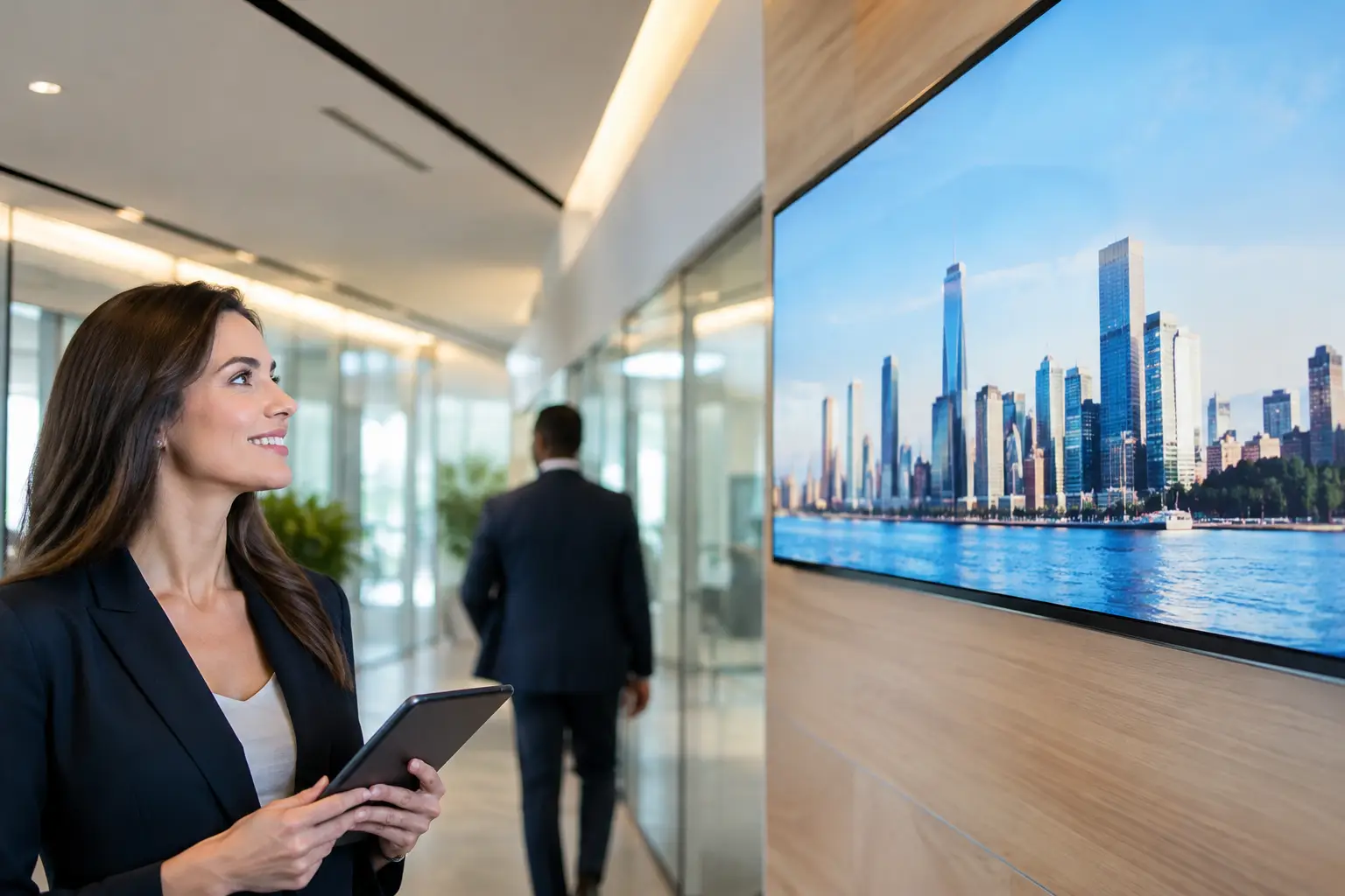
How to Design TV Templates for Any Screen
Learn how to design TV templates that stay clear from a distance, protect your brand, and update quickly across every location at scale.
En esta página
A TV screen is not a flyer, a web page, or a social post. People see it while walking past, waiting in line, working out, or deciding what to buy. That changes how to design TV templates: every layout must communicate one useful idea quickly, from several feet away, without relying on someone to stop and study it.
For restaurants, retailers, clinics, gyms, hotels, and multi-location teams, a strong template system turns screens into a reliable operating channel. A weak one creates clutter, inconsistent messaging, and updates that take too long. The goal is simple: build flexible screen layouts your team can update in minutes while keeping every location on brand.
Start With the Screen's Job
Before choosing colors, fonts, or images, decide what each screen needs to accomplish. A lobby display may reduce check-in questions. A menu board may move customers toward high-margin items. A retail screen may promote a limited-time offer, while a staff-room display may share operational updates.
One screen can rotate through multiple messages, but each template should have a single primary job. Trying to fit a promotion, event calendar, company mission statement, product catalog, QR code, and social feed into one layout usually means none of it gets noticed.
Write a short outcome statement for each template. For example: “Help waiting patients understand what to do next,” or “Promote this week’s membership offer.” That statement should guide every design decision that follows.
How to Design TV Templates for Distance
The most common digital signage mistake is designing at laptop distance. A layout can look polished in an editor and become unreadable on a 55-inch screen across a room.
Start with a clear visual hierarchy. The main message should be the largest element on the screen. Supporting information comes second. Details such as dates, eligibility, or a call to action come last. If everything is large, bold, and colorful, nothing has priority.
Use a simple rule: a viewer should understand the core message in about three seconds. “Happy Hour 4-6 PM” works. “Explore Our New Selection of Carefully Curated Seasonal Beverage Options” does not. Put the offer or instruction first, then add only the detail needed to act on it.
Make type large enough to work
Avoid treating TV text like body copy in a brochure. Headlines need to be oversized, high contrast, and short. Supporting text should still be readable without squinting. If a message requires several lines of small text, split it into separate slides or simplify the message.
Stick to one or two font families. Use weight, size, and spacing to create hierarchy instead of introducing a new typeface for every section. Consistent typography makes a template easier for local managers and non-designers to update without breaking the layout.
Use contrast, not just brand colors
Brand colors matter, but readability matters more. Light gray text on a bright photo or dark blue text on black may fit a brand palette and still fail on the screen.
Place text over clean background areas whenever possible. When an image needs to sit behind copy, use a solid color block, a subtle overlay, or a dedicated text panel. Test the screen in its actual environment too. Glare from windows, overhead lighting, and viewing angle can change what is readable.
Build a Layout System, Not One-Off Slides
A good template does not force every message into the same box. It creates a small, repeatable set of layouts that cover your most common needs.
For many businesses, four template types are enough to start:
A promotion template for offers, seasonal products, and featured services
An information template for hours, directions, policies, or wait-time guidance
An event template for classes, appointments, launches, and local programming
An announcement template for urgent notices, internal updates, or service changes
Each type should use the same visual rules: logo placement, brand colors, font styles, safe margins, and approved image treatment. The content can change, but the screen should still feel like it belongs to the same business.
This system also prevents the “blank canvas” problem. When a manager needs to promote a weekend sale, they should only need to replace the headline, image, price, and dates. They should not have to decide where every element belongs.
Leave room for changing content
Templates need constraints, but they also need breathing room. A design that only works with a four-word headline will fail the first time someone needs to add a product name, price, and deadline.
Set practical limits inside the template. Define a maximum headline length, a recommended image ratio, and a fixed area for prices or dates. Use placeholders that make the expected content obvious, such as “Offer headline,” “Valid through,” or “Scan for details.” These guardrails keep updates fast and protect the original design.
Design for Motion Without Creating Distraction
Digital screens can move, but motion is not automatically better. Fast animations, spinning logos, and frequent transitions compete with the message, especially in restaurants, clinics, and offices where people may see the screen repeatedly.
Use motion to guide attention, not decorate empty space. A gentle fade, a short entrance for the headline, or a subtle product transition can help. Keep animations brief and predictable. If viewers must wait for text to appear or watch a sequence to understand the offer, the design is working against them.
Timing matters just as much. A simple promotion may need only 7 to 10 seconds on screen. A menu, event schedule, or instructional slide may need 12 to 20 seconds, depending on how much reading is required. When in doubt, reduce the copy before extending the duration.
Plan for Different Screen Sizes and Orientations
A template built for a landscape TV will not automatically work on a portrait display. The same is true for a screen behind a counter versus a large display in a window. Build separate versions when the viewing context changes significantly.
Keep key content inside safe margins. TV displays can crop edges differently, and screens may have physical bezels or mounting positions that reduce usable space. Do not place prices, QR codes, or calls to action tight against the border.
QR codes deserve special attention. They need enough size and contrast to scan from the expected distance, plus a clear reason to scan. “Scan to join the rewards program” is stronger than a code sitting alone in the corner. For fast-moving foot traffic, a short URL or text prompt may work better than a QR code.
Make Templates Easy to Manage Across Locations
The design is only half the system. The other half is how quickly your team can publish, schedule, and verify content. A polished template has limited value if updates still depend on sending files, loading USB drives, and hoping every store uses the right version.
Centralized signage software changes the workflow. Teams can create approved templates, update content from one dashboard, schedule campaigns by location or time of day, and check whether screens are online. With VitVue, existing Smart TVs or streaming-stick-connected displays can become centrally managed screens without adding traditional media players or waiting on an IT team.
For multi-location brands, protect the elements that should never change: logos, colors, layout structure, legal language, and core campaign messaging. Give local teams controlled areas to personalize, such as store hours, local events, inventory-specific offers, or manager announcements. That balance keeps the brand consistent without making every update a corporate bottleneck.
Test the Template Where It Will Be Seen
Do not approve a TV template based only on an editor preview. Put it on a real screen in the real location. Walk to the farthest expected viewing point. Look at it while moving. Check it in bright daylight and after dark.
Ask practical questions: Can customers read the price? Is the call to action visible before they pass the screen? Does the image still look sharp? Is the screen competing with nearby signs, windows, or menu boards?
Then use performance signals. If a promotion has a trackable code, measure responses. If a menu item is featured, compare sales during the campaign. If an informational screen aims to reduce repeated questions, ask frontline staff whether it is working. Templates should improve based on what people actually do, not just what looks good in a review meeting.
The best TV template is rarely the most decorative one. It is the one that helps the right person notice the right message at the right moment, then gives your team the control to change it before the moment passes.